
kira.
A styling app I built for myself, to stop guessing in the morning, dress in the colors that actually flatter me, and feel like I shine.
why I built this
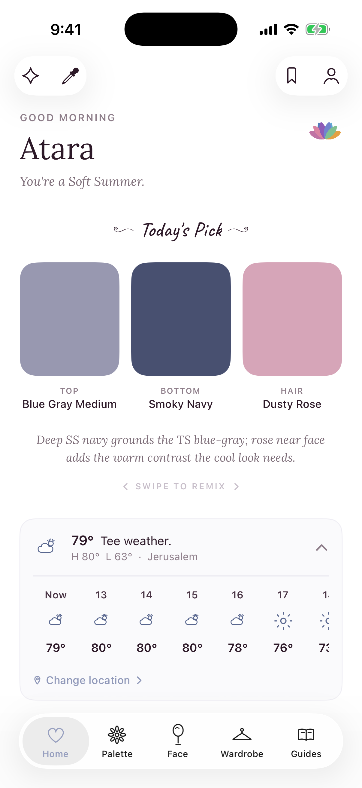
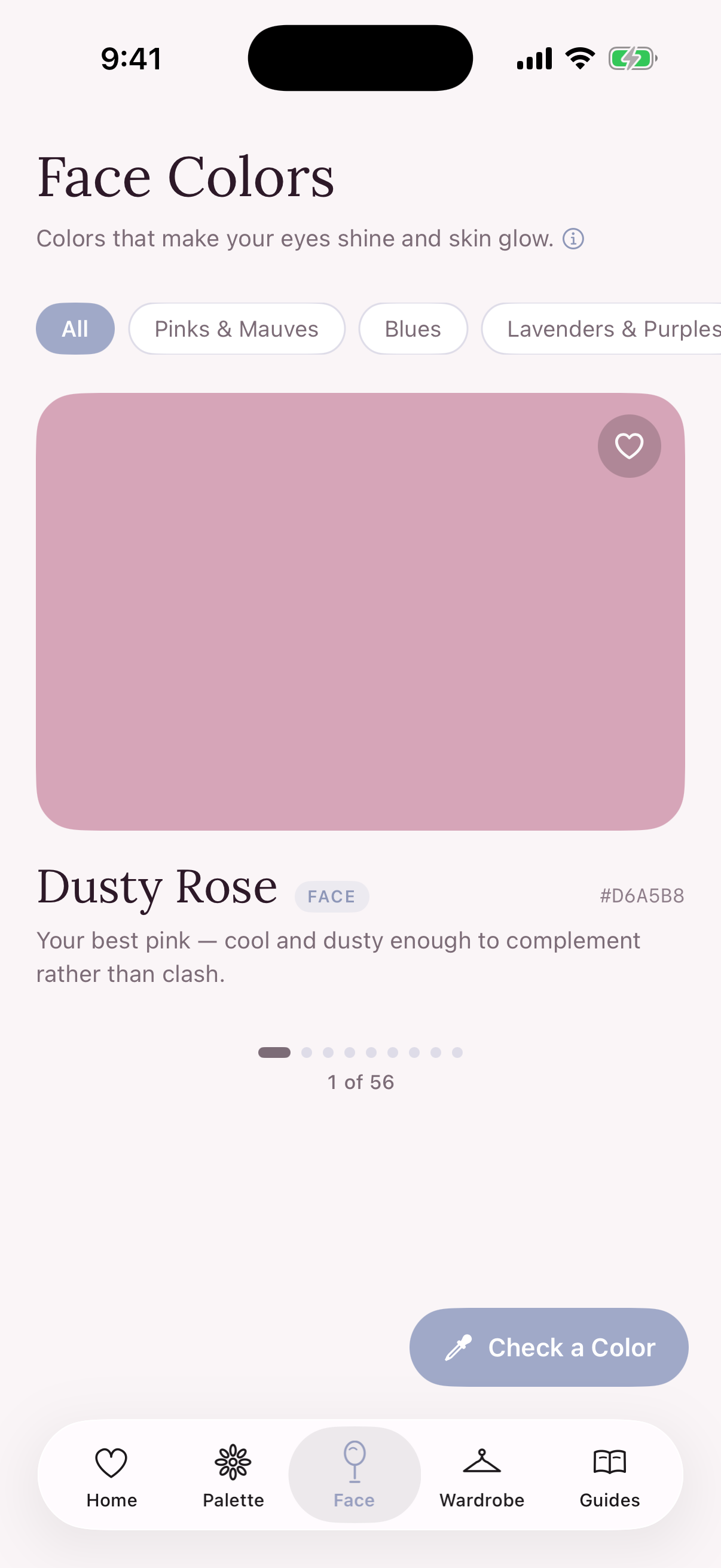
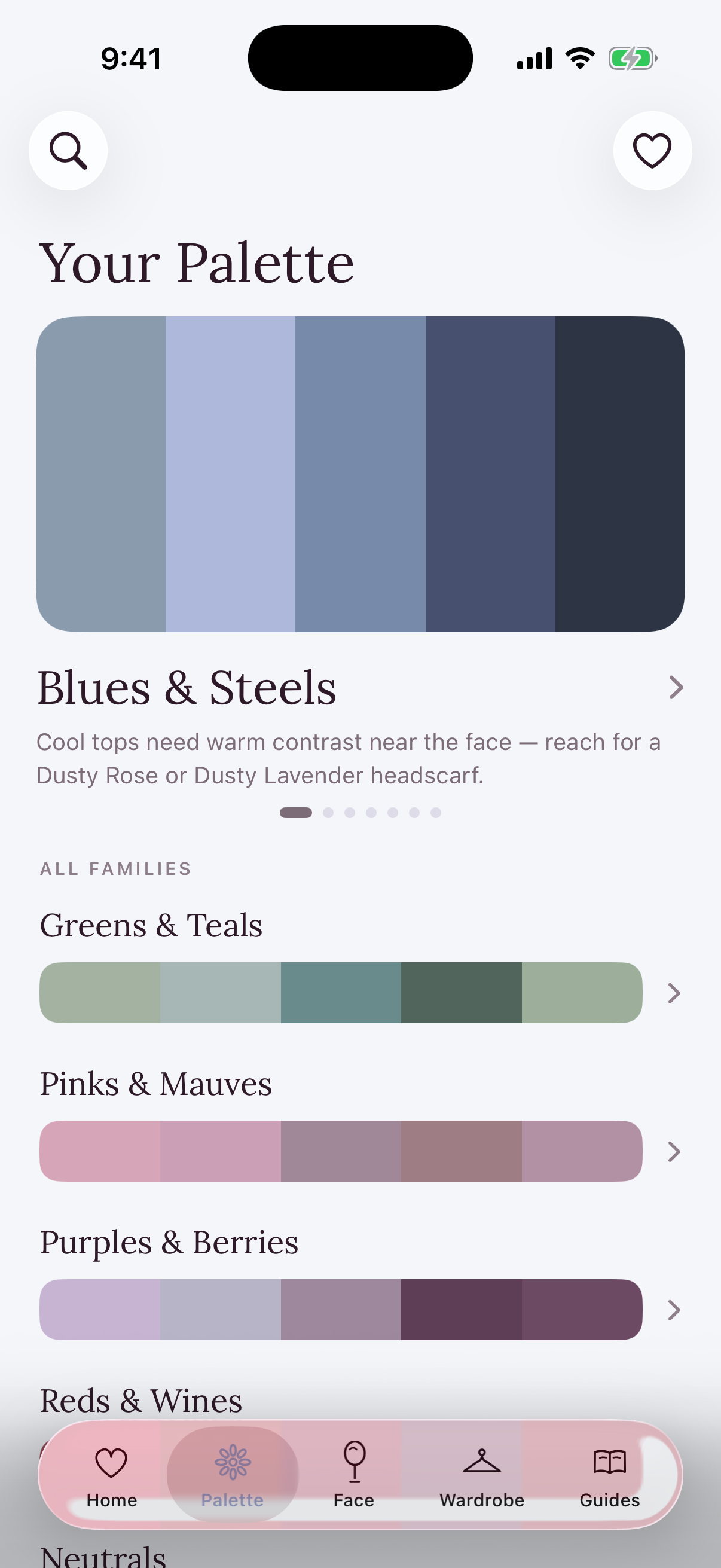
finding my colors
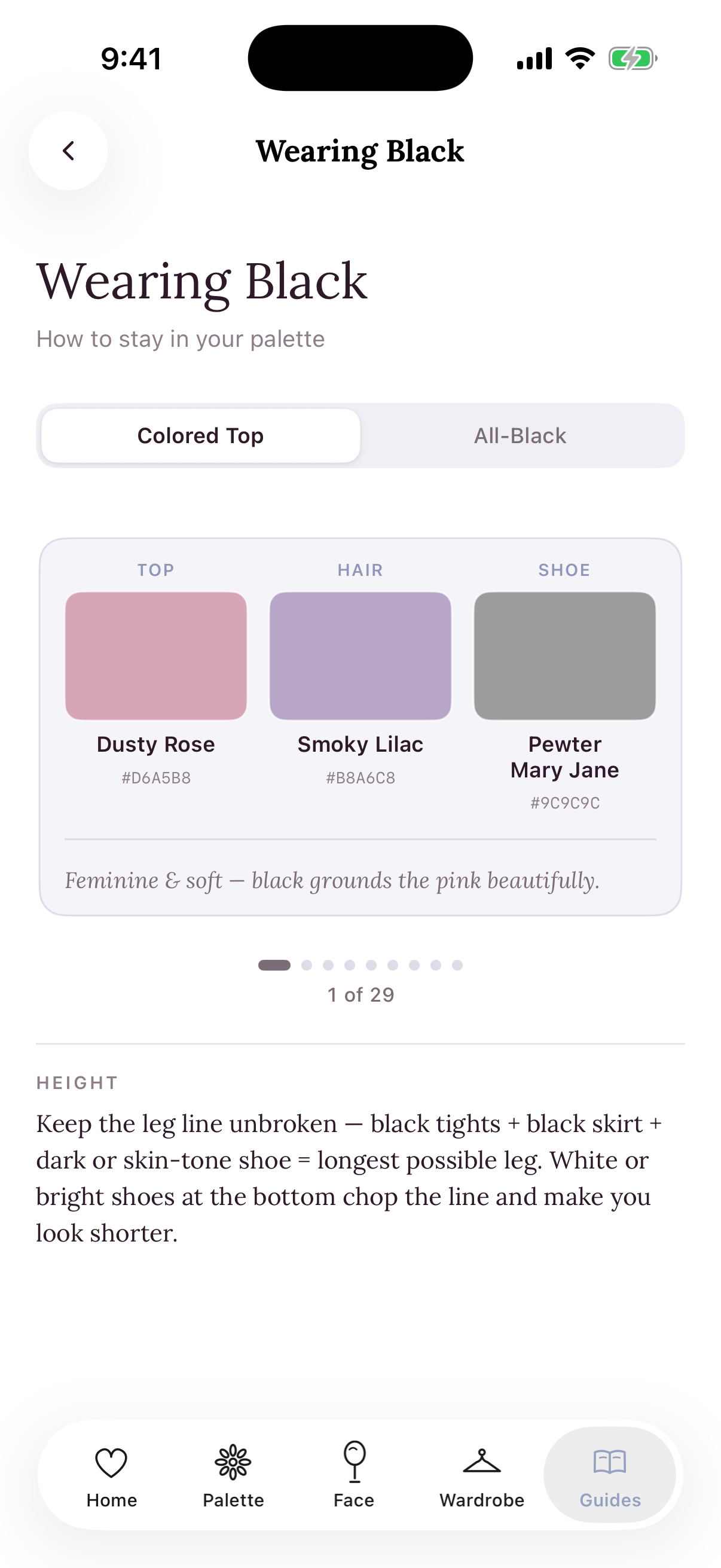
dressing what I already own
it isn't a color-analysis app
what's on my phone today
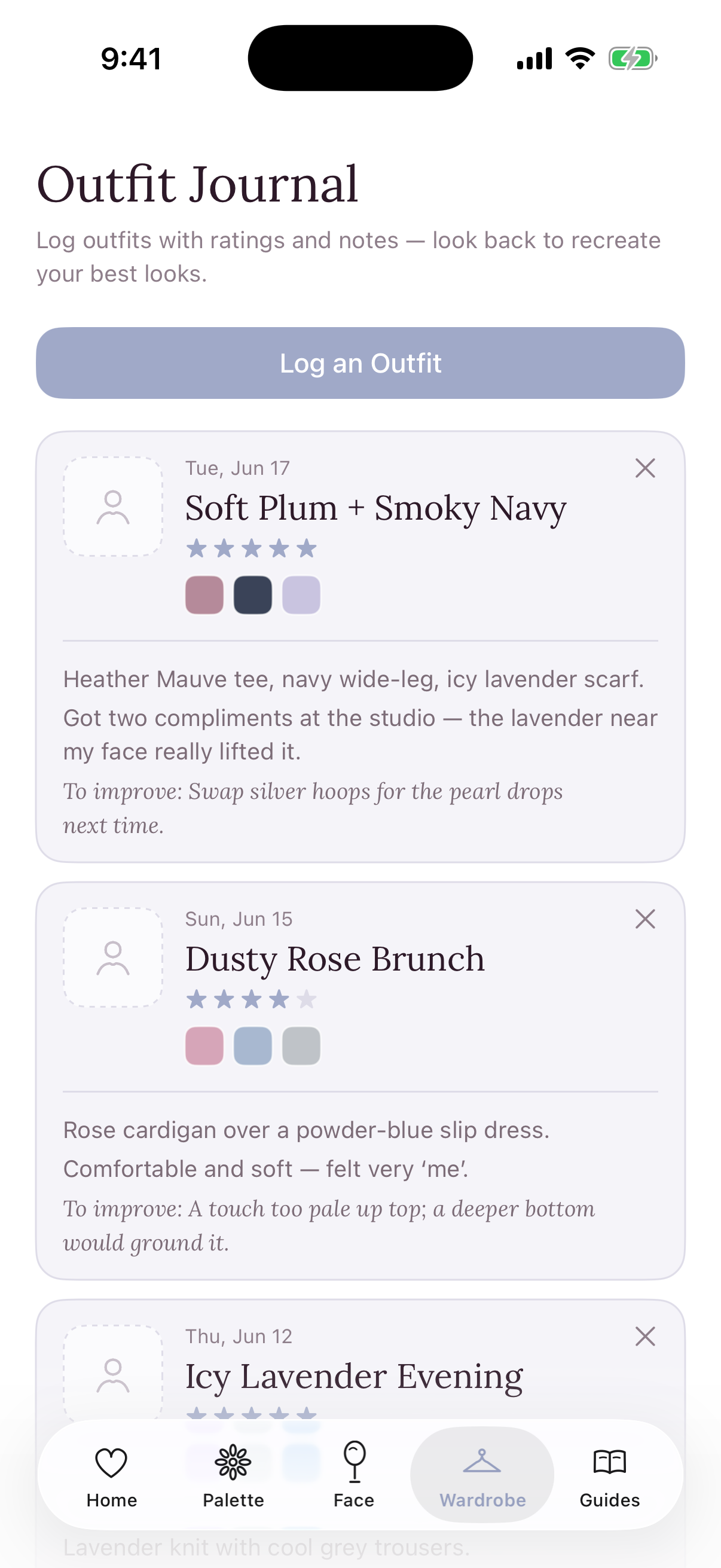
soft tells, not flourishes
Motion does quiet work here: lists settle in with a gentle, staggered reveal instead of a snap, and the little moments ease in rather than pop. There’s even a hidden one, long-press the greeting and Kira’s flower mark blooms open. Nothing bouncy, nothing flashy; I wanted motion that feels quiet and a little delightful, the kind you barely notice, but that keeps pulling you back to open the app again.
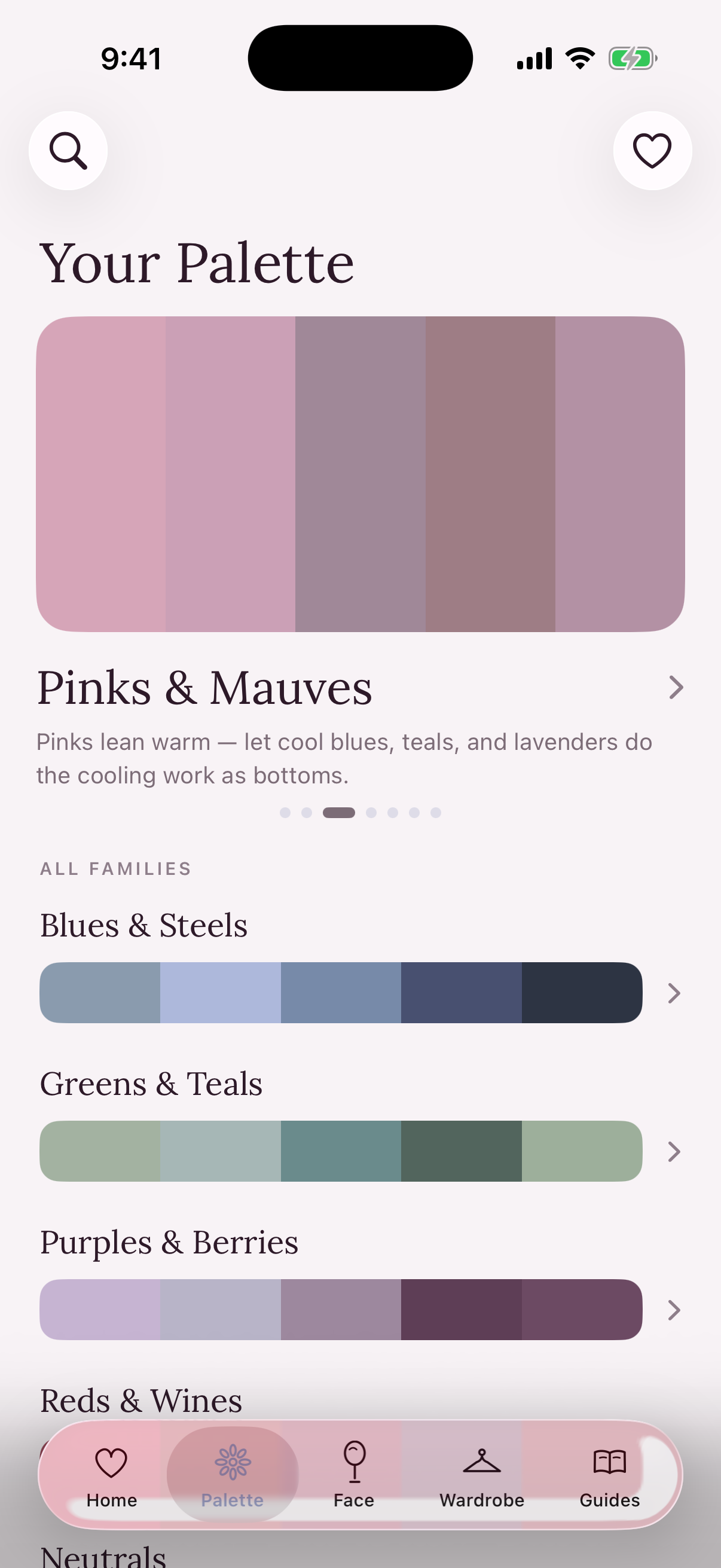
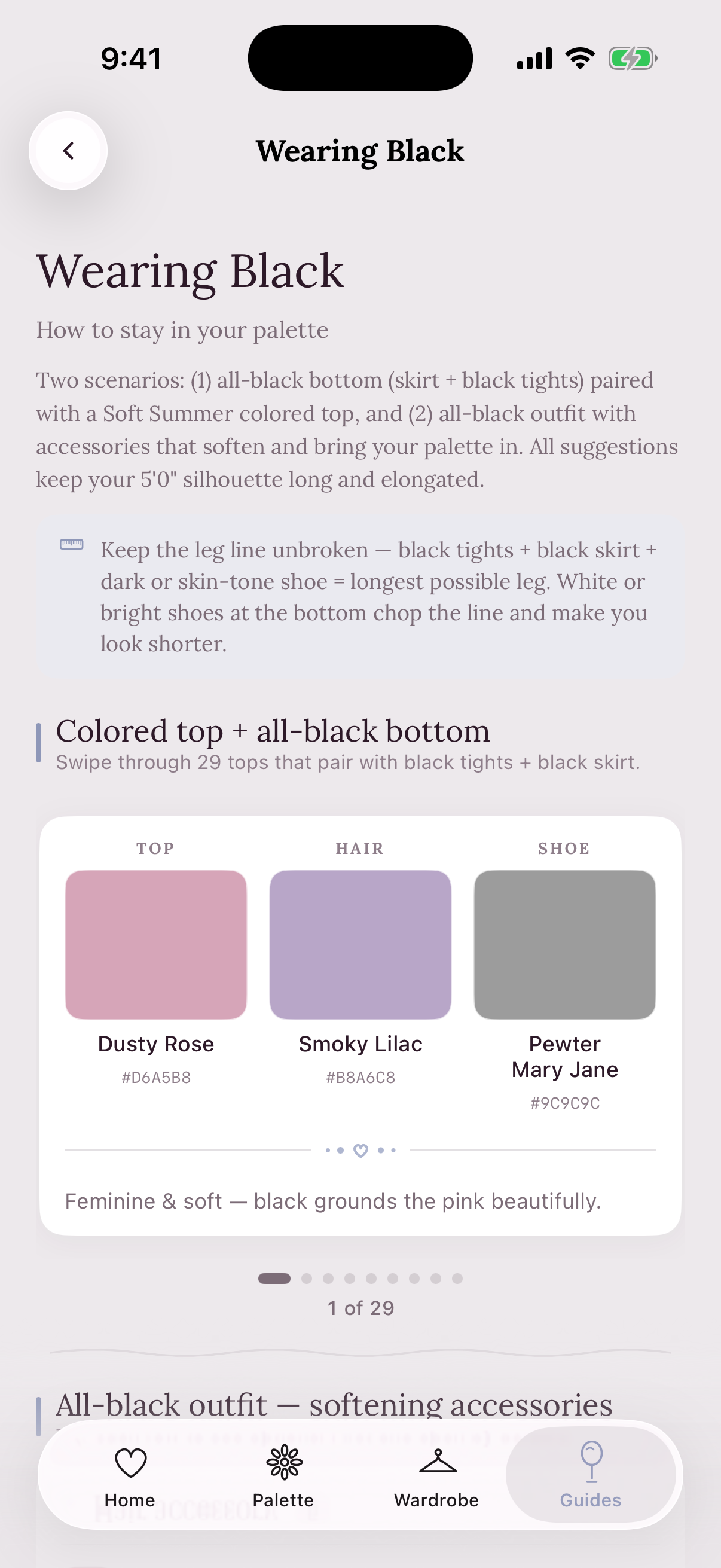
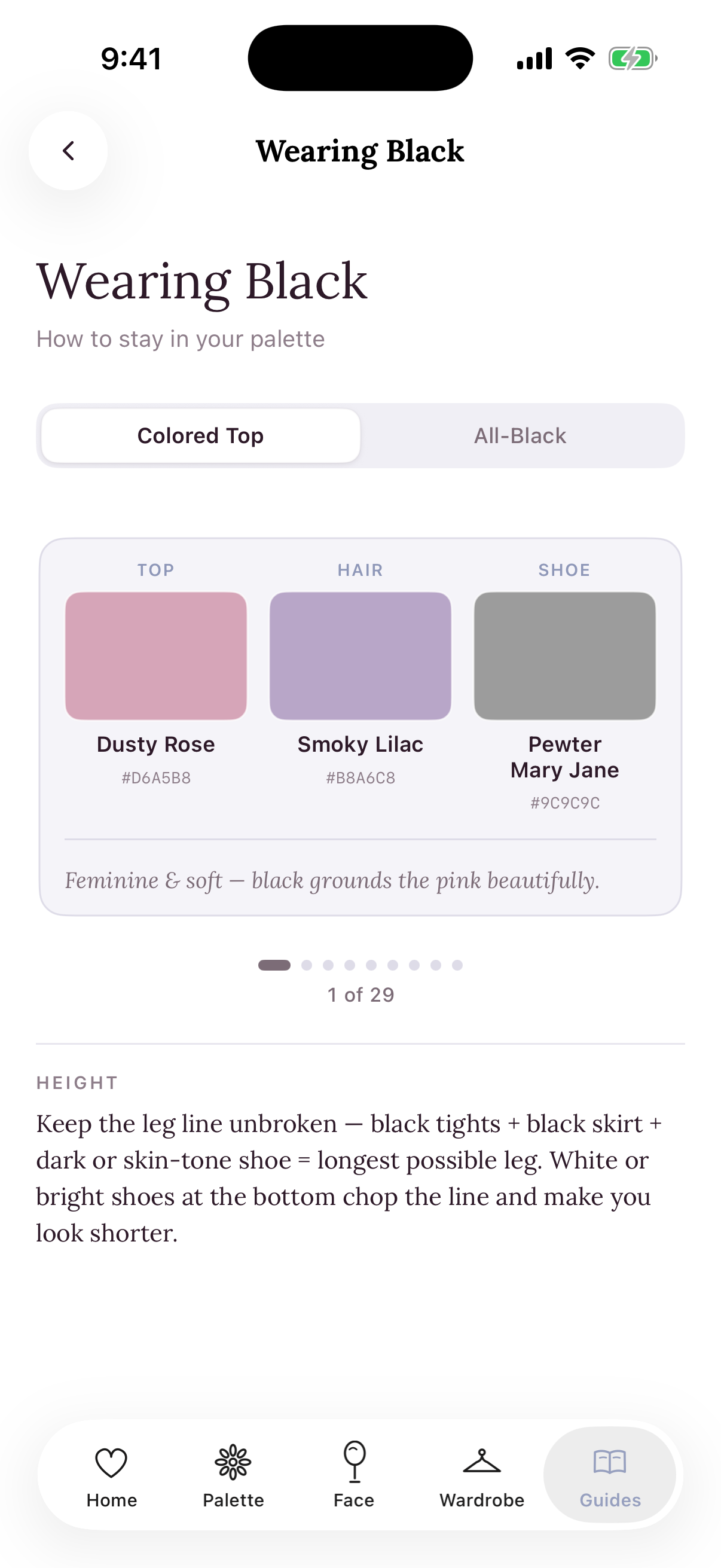
a look around the app
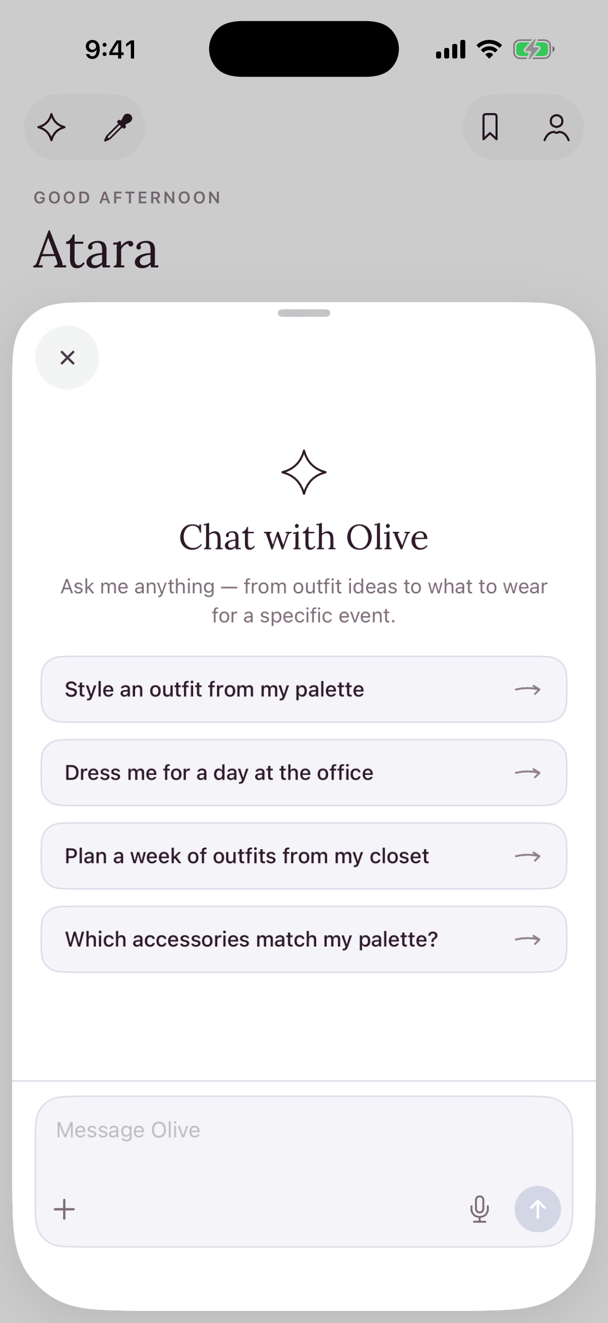
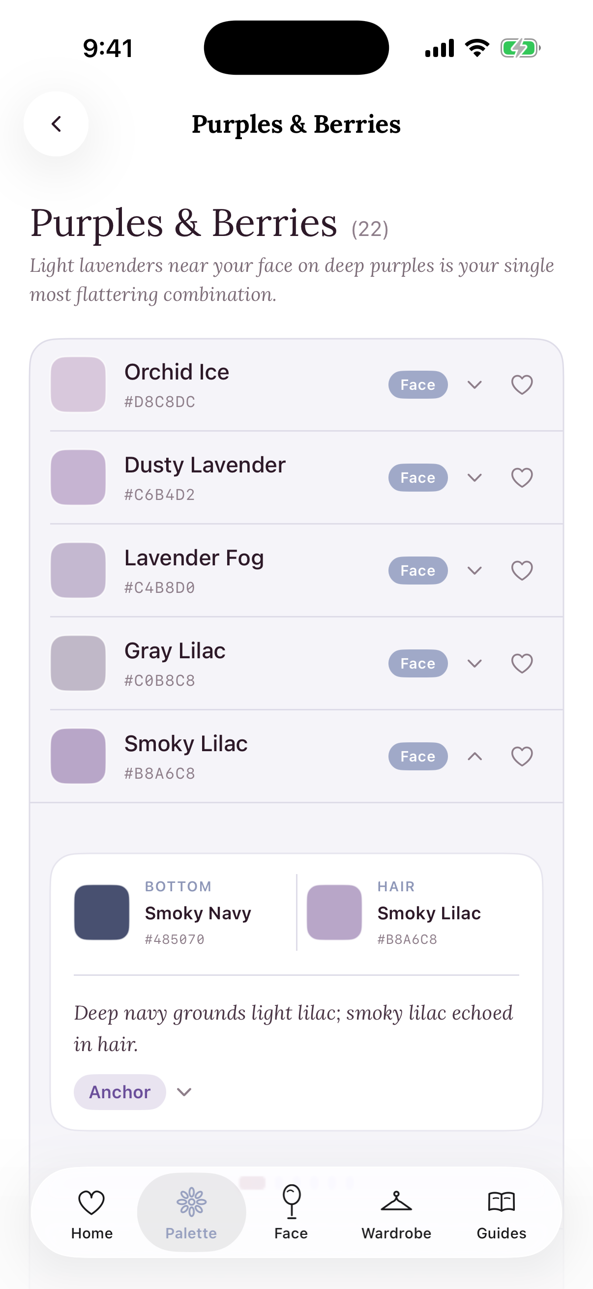
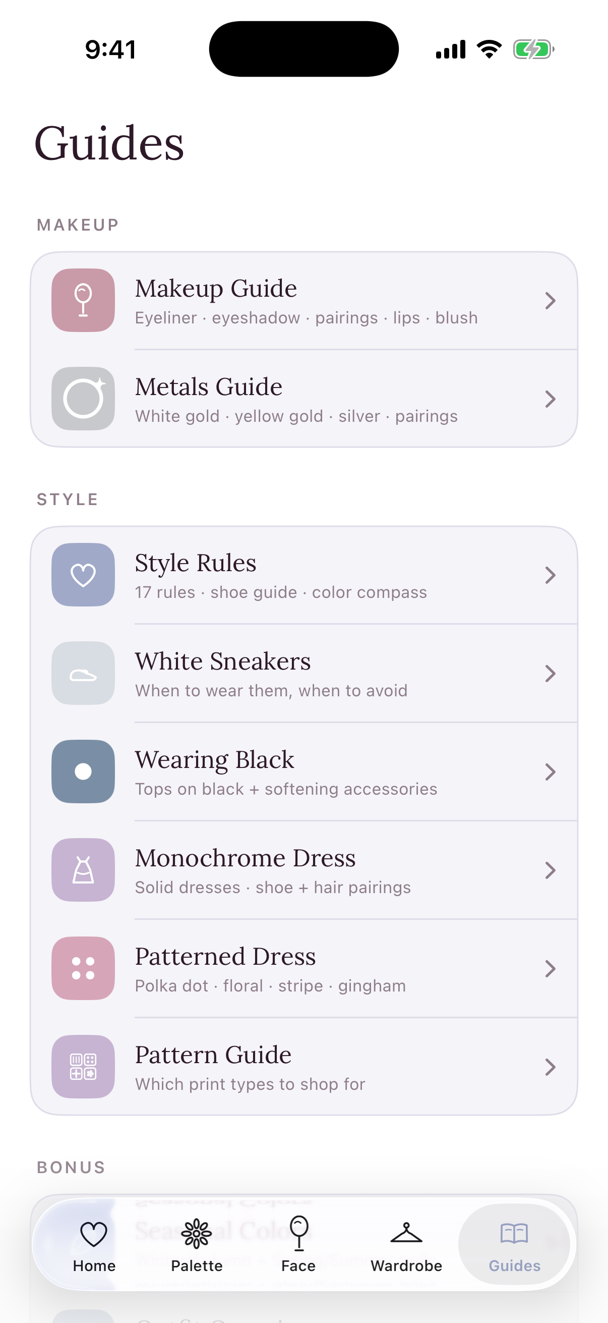
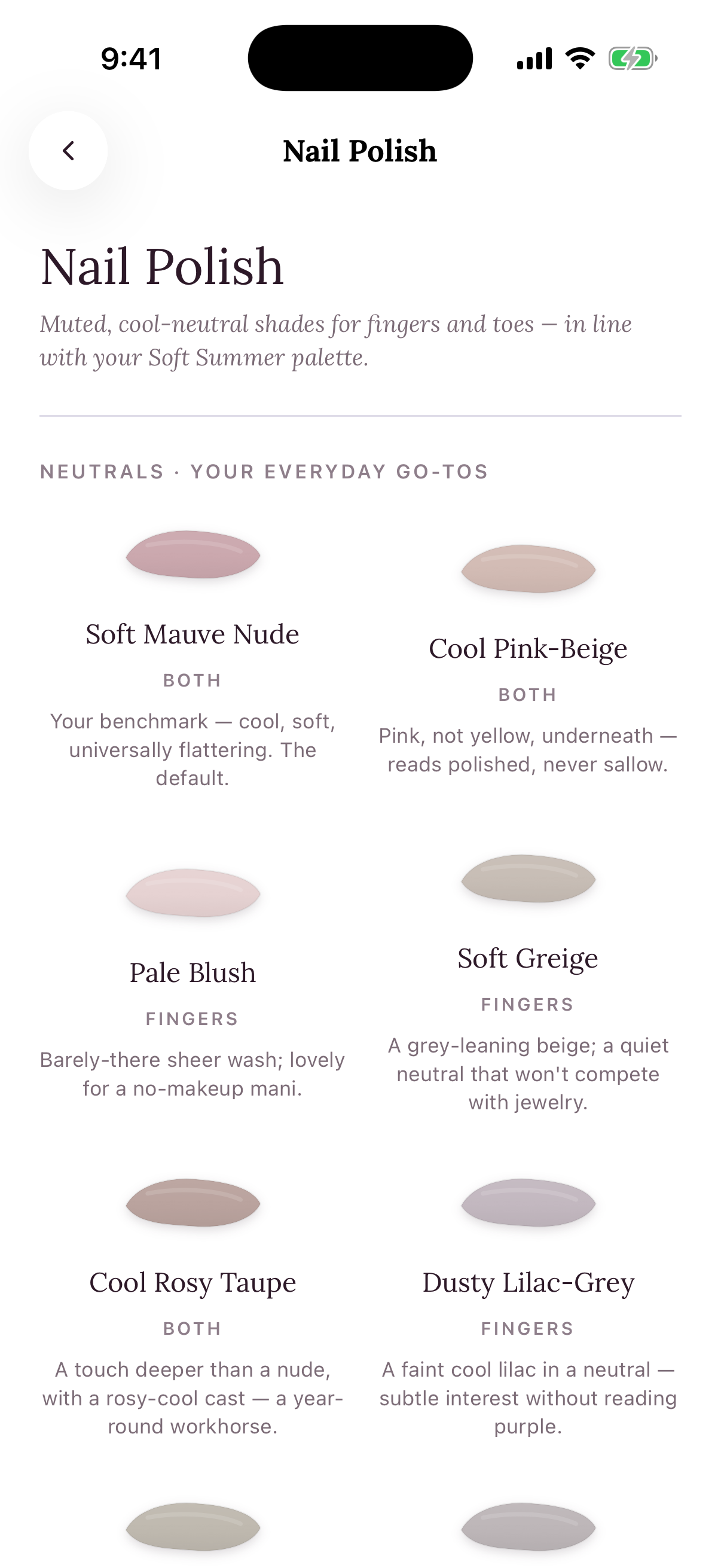
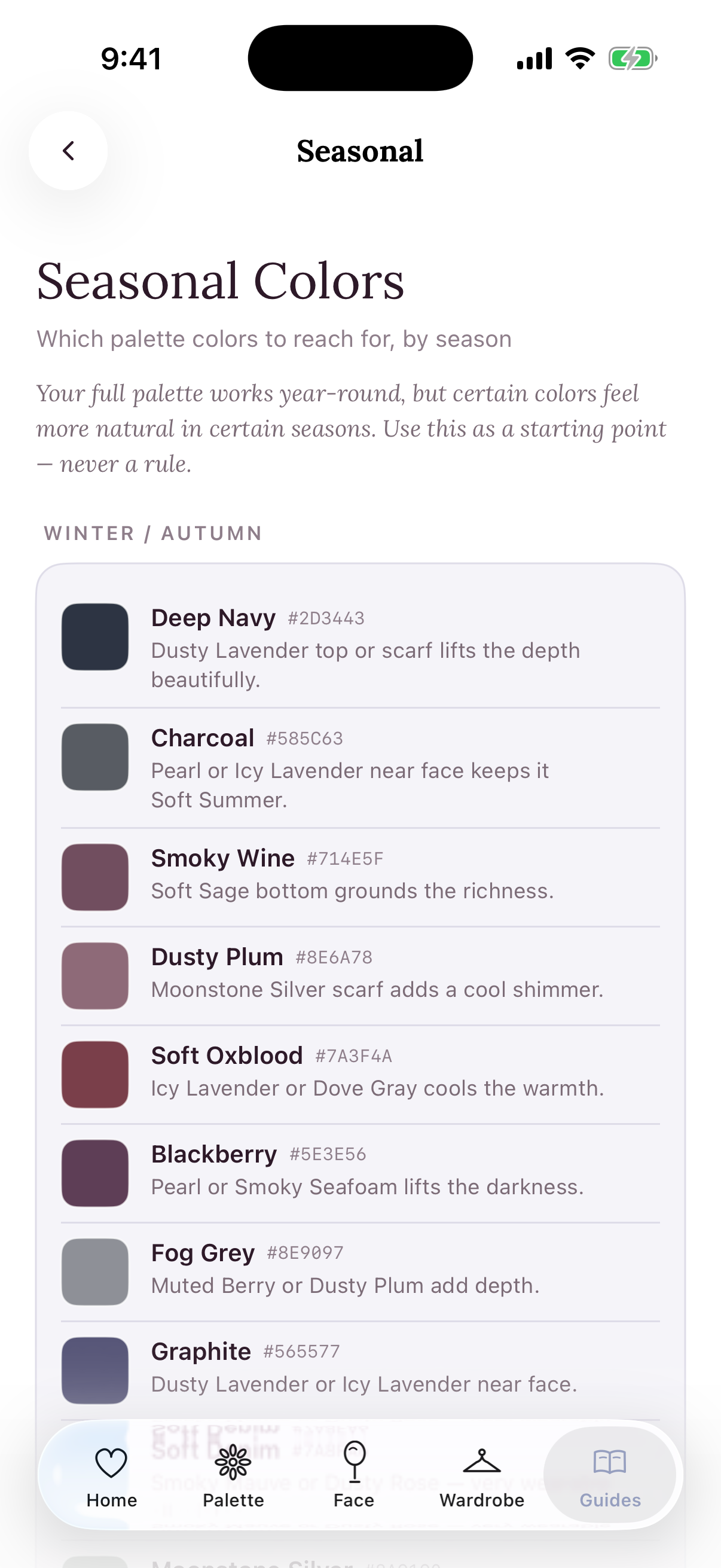
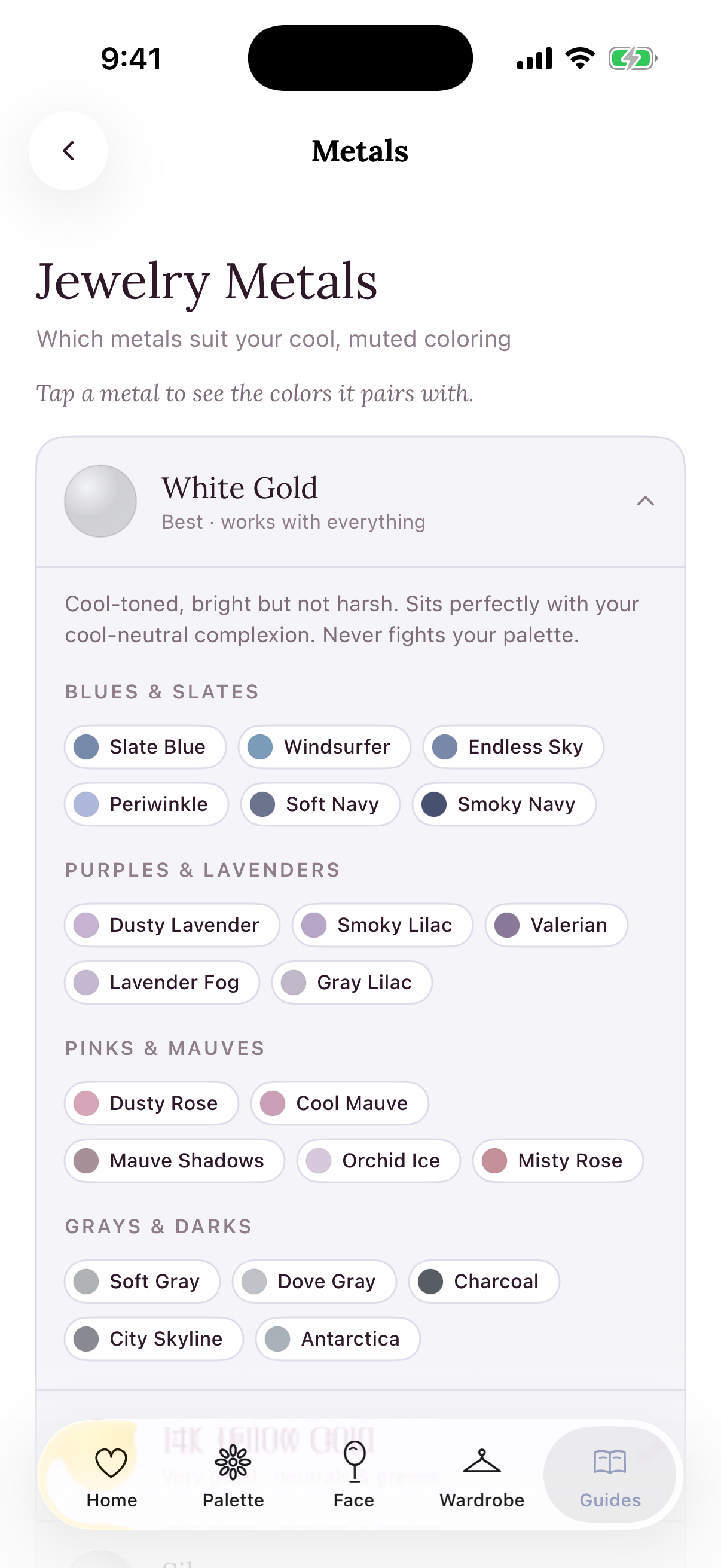
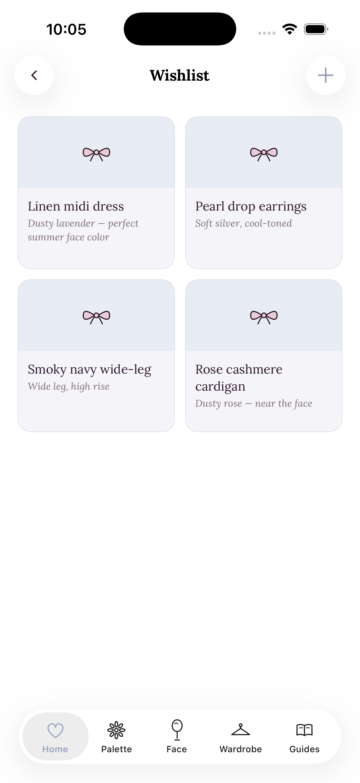
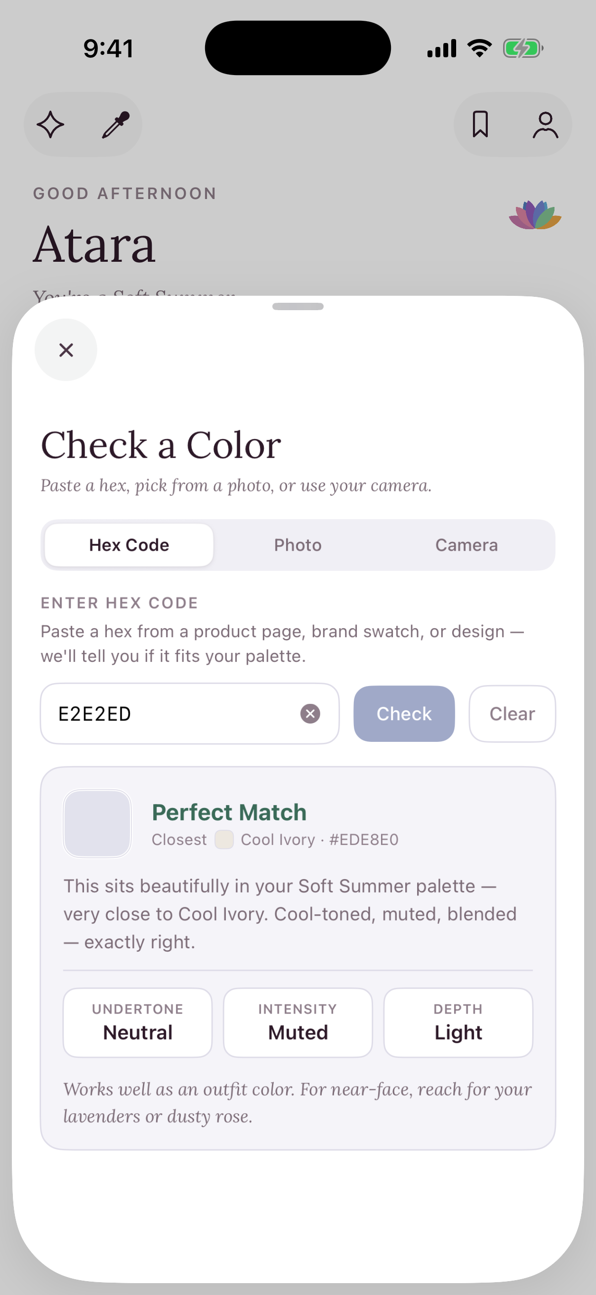
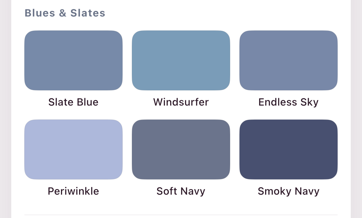
calm by default. swappable to any season.
the name & the mark
why kira, why a lotussurfaces
the near-white systempalette
season-swappabletype
three voices, strict lanescomponents
a peekiconography
hand-drawn doodles- ·stroke-only line work, never filled SF Symbols
- ·round caps & joins, a hand-drawn ~1.2 weight
- ·one ink tint; periwinkle only when active
- ·a single playful detail, the dress's little smile
motion & haptics
spring & micro-hapticsthe mark, the color & the name
How each one landed, the directions we explored, the ones we set aside, and why.
a flower made of your colors
It began as a palette-bloom: six petals, one per color family, radiating from an open center, soft and pale, your purple leading at the top. A flower built from your palette. From there we explored.
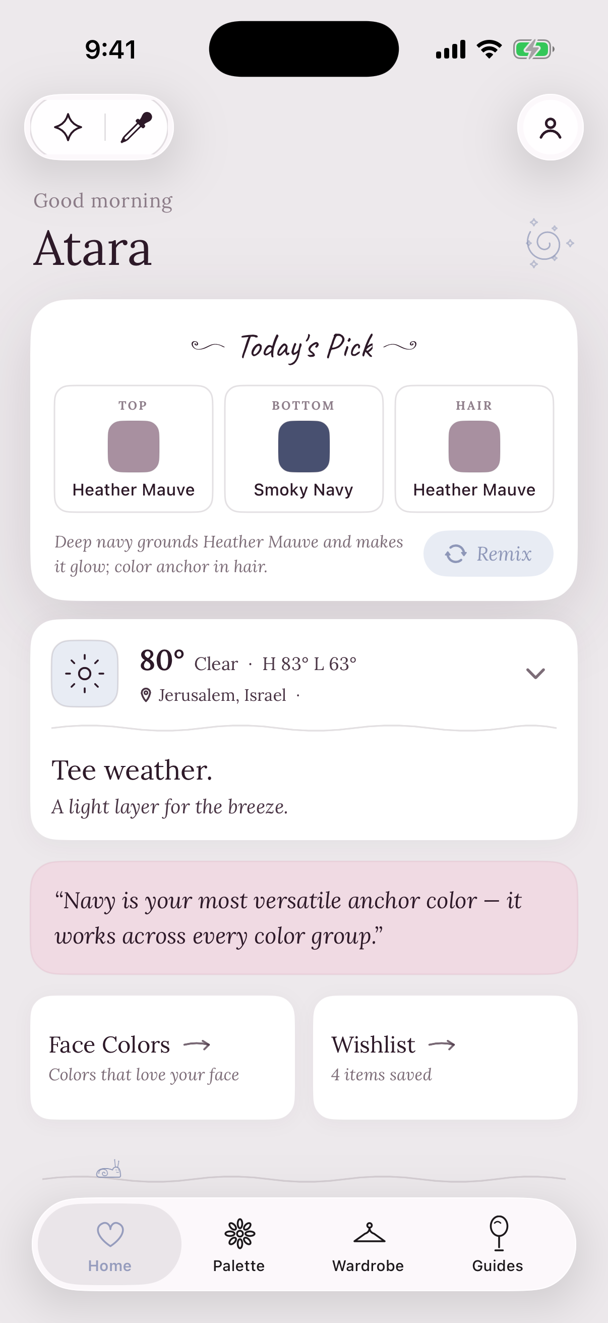
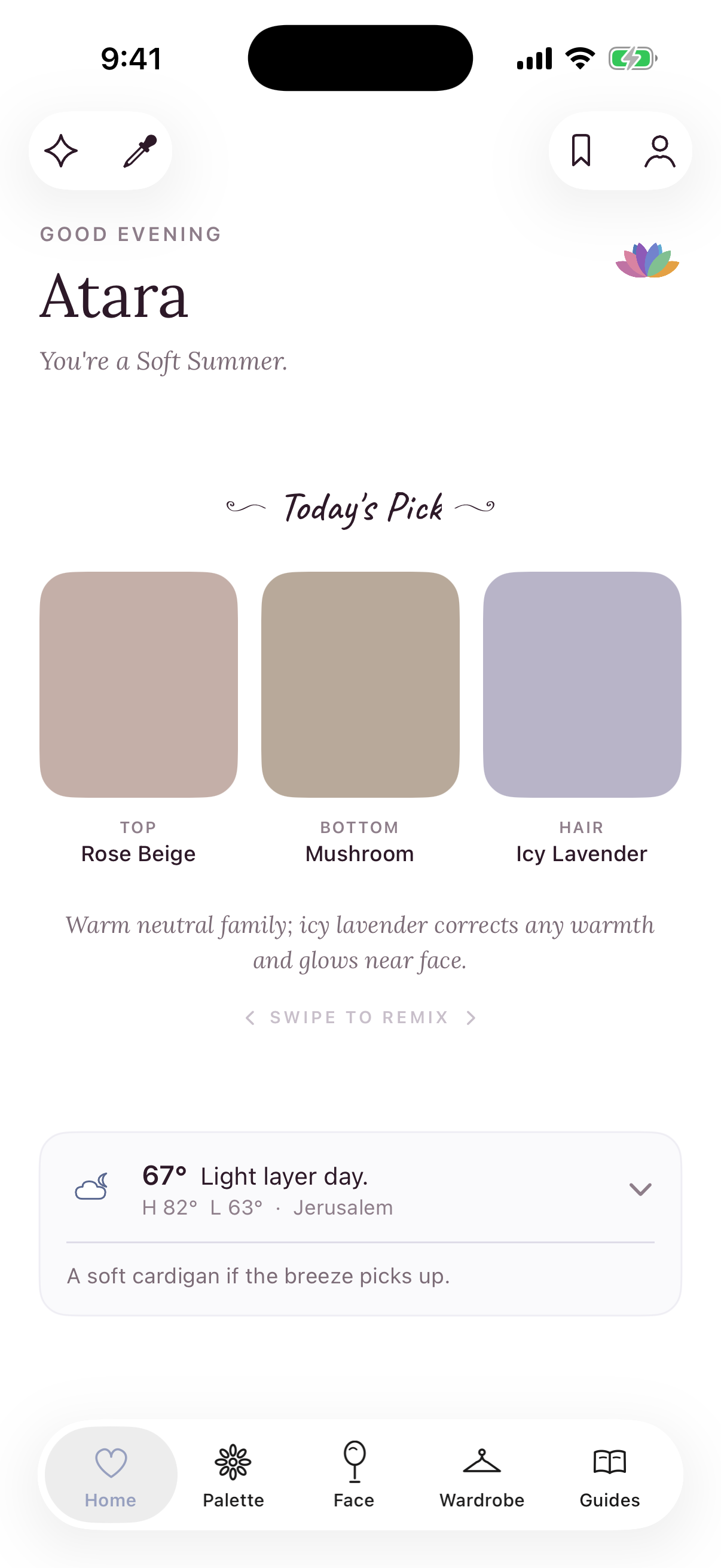
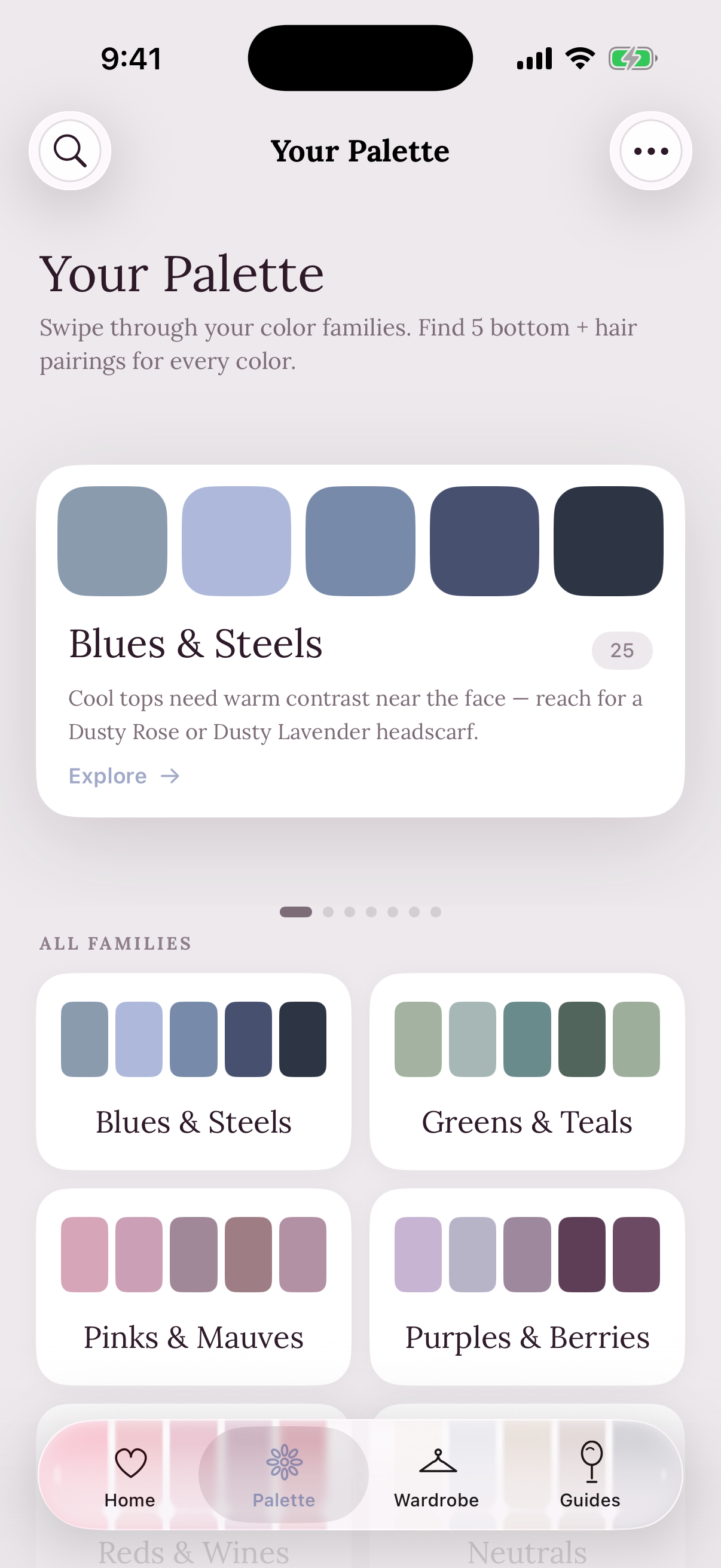
the icon is color, the name is the soul
The name took longer than the mark. A dozen made the shortlist, and fell away:
Kira won. From kira-kira, the Japanese word for the glint of light catching something and making it shine. It names the feeling, not the function, a page from Apple’s book: a name should carry the soul, the icon should carry the product, and the two don’t need to match. So the word says shine, the lotus says these are your colors, and where they meet, you get Kira.