Self-initiated · 2026 · web app

sprout.

A web app that keeps track of every piece your kids own, by child, size, and season. So you always know what fits, what’s coming up next, and when to grab it on sale.

webreactvite0 → 1uxdesign system
The origin

it usually starts as a spreadsheet

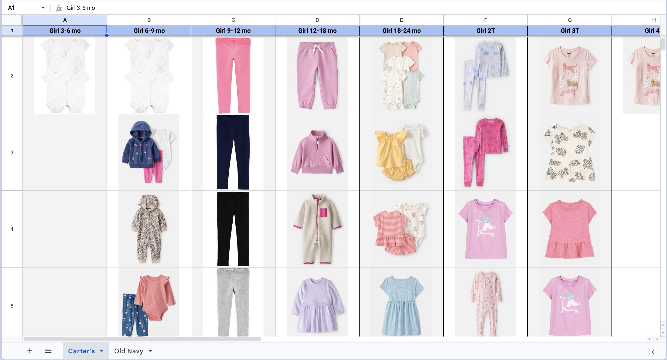
Before Sprout, the fix was a spreadsheet. I kept hearing the same setup from people: a column for every size, a tab per store, a photo pasted into every cell, because you need to see what you already own, not read “black leggings, blue shirt.” But a spreadsheet isn’t accurate, it isn’t organized, and it was never built for this. Stuff slips through, and you end up buying the same thing twice. Sprout is that same instinct, just given a real tool for the job.
docs.google.com · clothing inventory
A tracking spreadsheet, product photos pasted by size and store
Before: sizes across the top, a tab per store, a product photo in every cell
The visual fix

see what you own, not a list of words
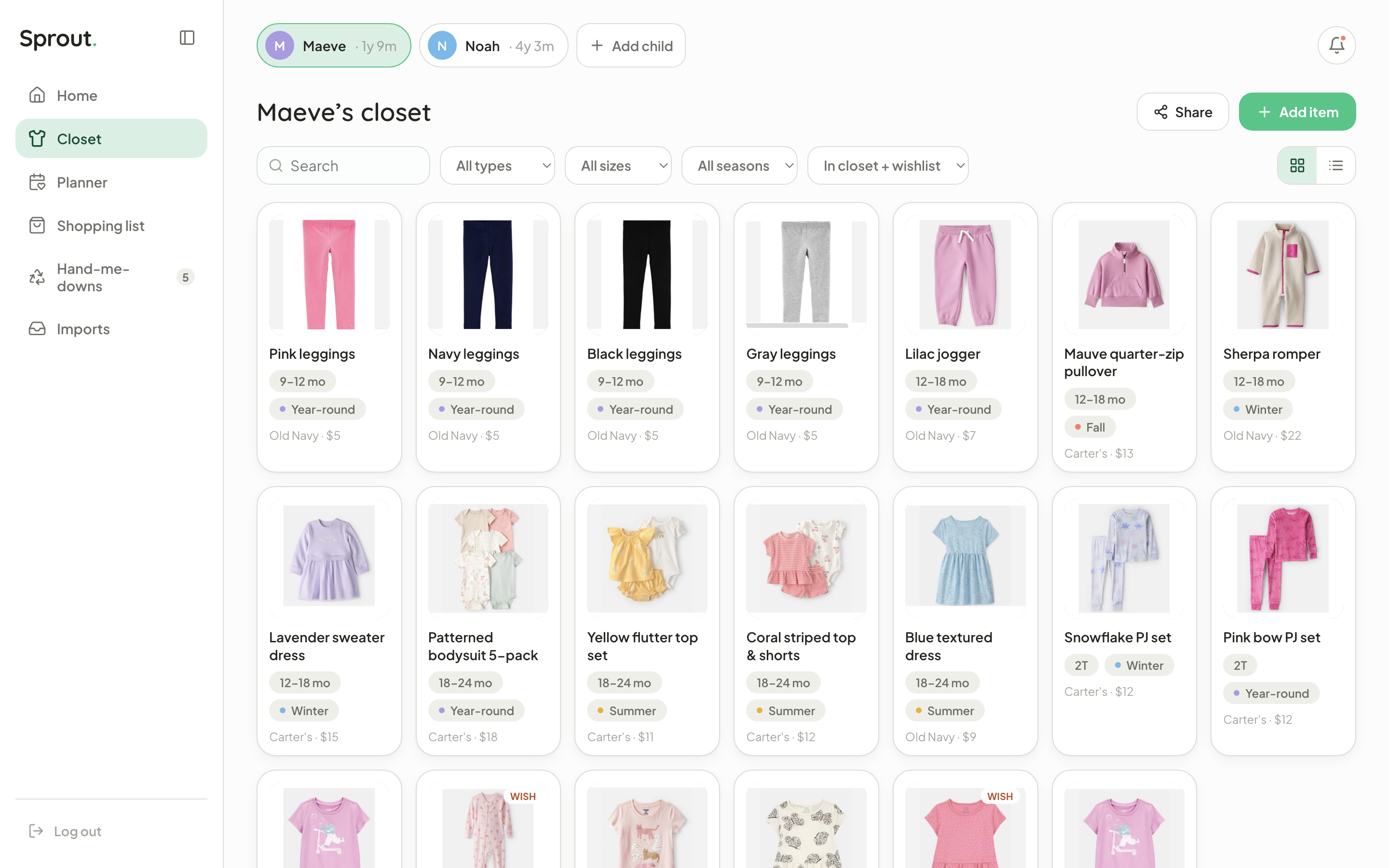
That spreadsheet was really trying to be a visual closet, so that’s what Sprout leads with. Every piece a kid owns, laid out as a photo grid: size, season, type, where it came from, what it cost, with wishlist items sitting right next to the ones you own. Filter to 6–9 months, Fall, and the gaps jump out, the one thing a grid of pasted cells could never really do.
sprout.app/closet
Sprout closet, filterable item grid
Closet: filter by size, season & type; wishlist pieces tagged
The edge

let the closet fill itself

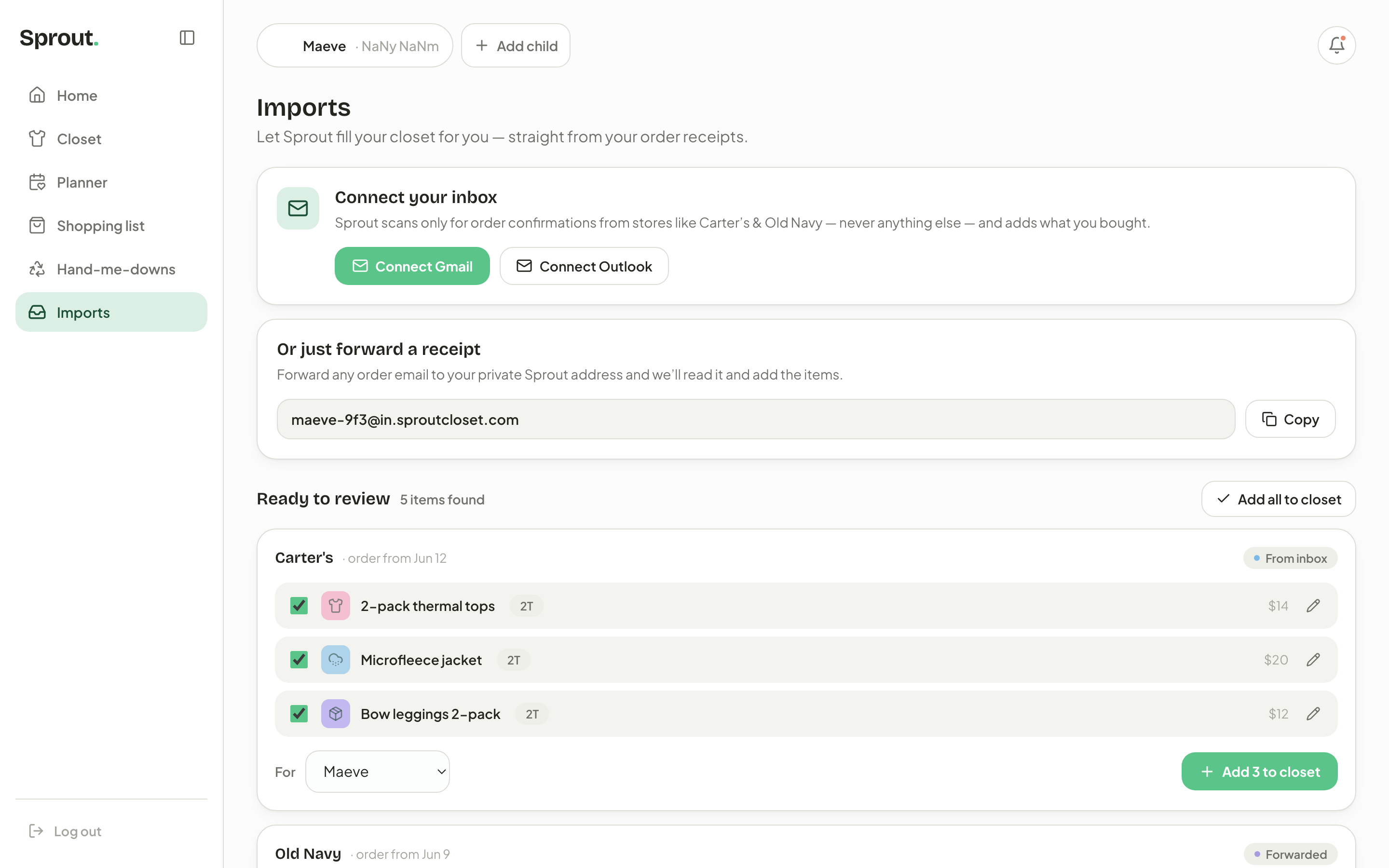
Filling a closet by hand is the part nobody keeps up with, so Sprout does it for you. Connect your inbox and it watches for order confirmations from the stores you shop. Or just forward any receipt to your private Sprout address. Either way, it reads the email, pulls out each piece (name, size, what you paid) and lines them up for you to review before they hit the closet. You can still add things by hand. But this is the part a spreadsheet could never do: the software does the typing for you.
sprout.app/imports
Sprout imports: connect your inbox or forward a receipt to auto-fill the closet
Imports: connect your inbox or forward a receipt; Sprout reads it and adds the items
The planner

plan the next size, by season

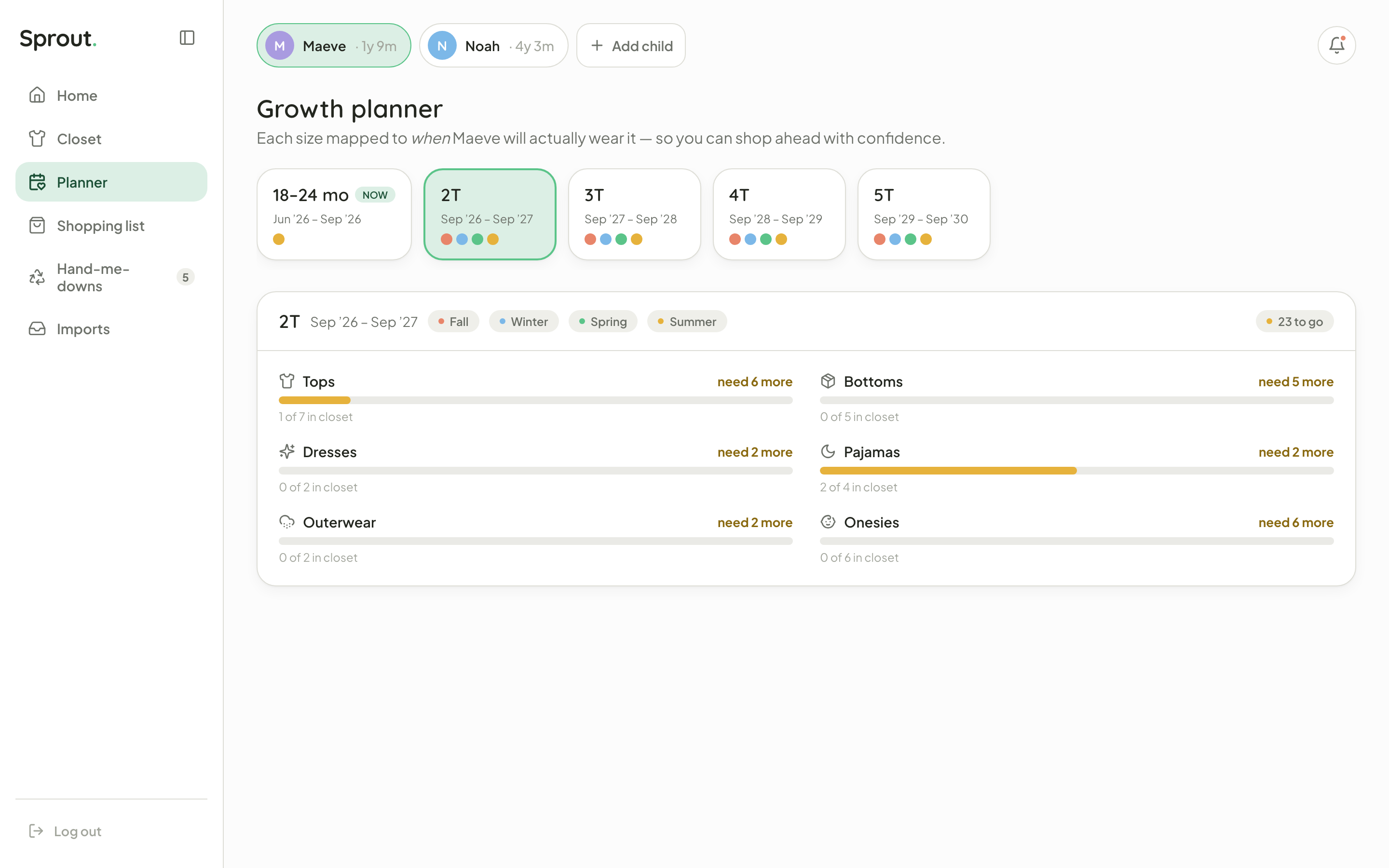
The growth planner is the heart of Sprout. It maps each upcoming size to when the kid will actually wear it (2T runs Sep ’26 to Sep ’27, fall through summer), so every category shows how stocked you are and what’s still missing. “23 to go” for 2T isn’t a guess. It’s tops 1 of 7, bottoms 0 of 5, and so on. That’s the exact list you shop the off-season sales against.
sprout.app/planner
Sprout growth planner, sizes mapped to seasons
Growth planner: each size mapped to the season it'll be worn
The payoff

catch the sale before they grow

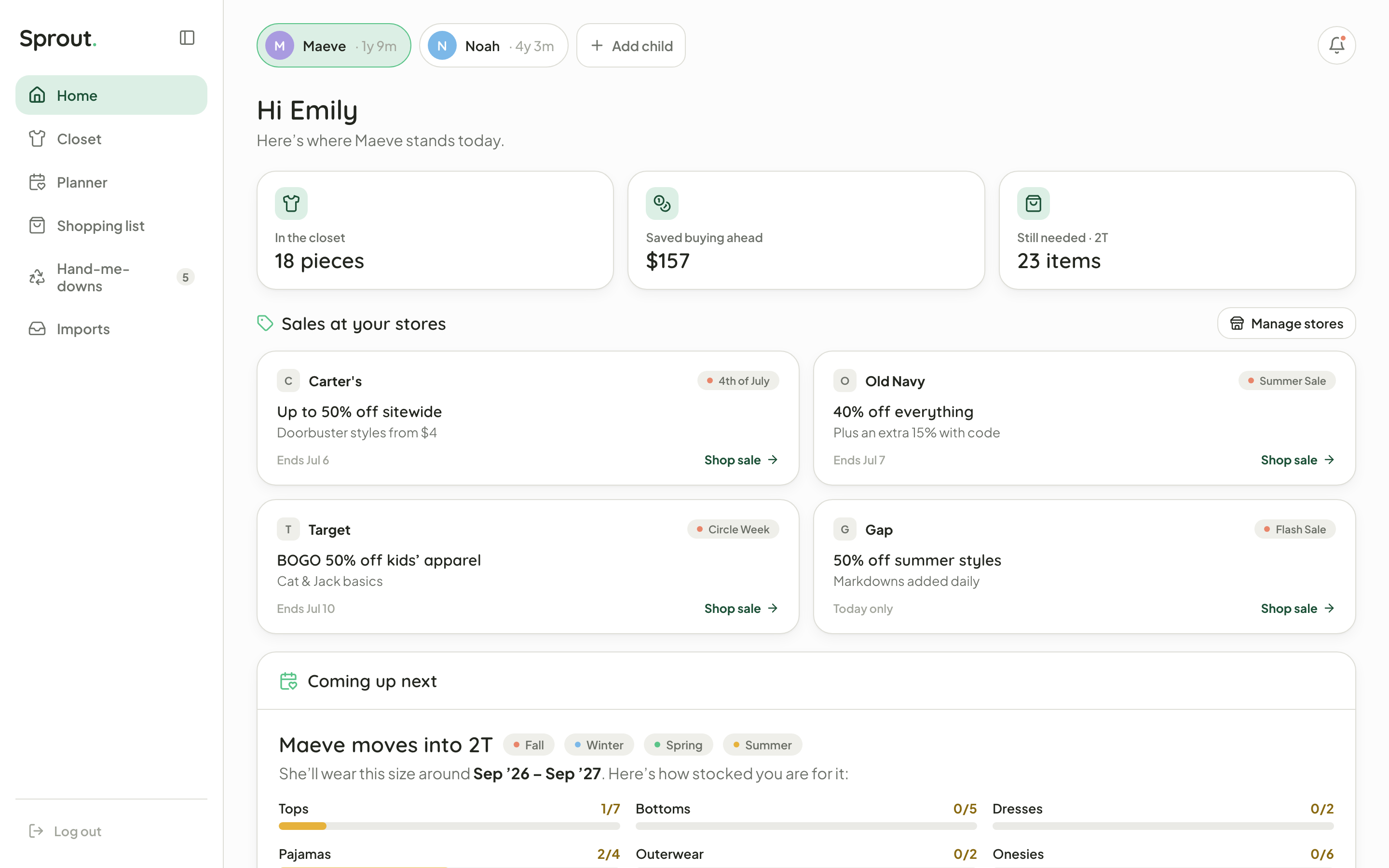
The home dashboard turns all that tracking into something you act on. Three numbers up top: pieces in the closet, money saved buying ahead, and what’s still needed for the next size. Below that, live sales from the stores you actually shop: Carter’s, Old Navy, Target, Gap, plus a “coming up next” card showing how ready you are for the size your kid is about to hit. That closes the whole loop: know what they need, see the sale, buy ahead.
sprout.app/home
Sprout home dashboard: savings, store sales, what's coming up
Home: savings, your stores' live sales, and what's coming up next
The business

the buy-ahead list is the business model

Sprout already does the one thing retailers pay for: it tells a parent exactly what to buy, in what size, and when it’s on sale. That intent is the whole asset. So the core app stays free, and the money rides the purchase the planner was already pointing at.

Affiliate commissions

The core engine. When the gap list says “2T bottoms, 0 of 5” and the sale is live, that buy button is an affiliate link. Sprout takes a cut (usually 1 to 10%) of every checkout it sends, right at the moment of highest intent, and the parent doesn’t feel a thing.

Retailer placements

The sales rail is inventory. Brands already fight for the off-season shopper. That “live sales” row on the home dashboard is a slot a retailer can pay to be in, but a sponsored spot still has to be relevant to the kid’s next size to earn the tap.

Sprout+ subscription

Keep the core free. Tracking stays free so the affiliate funnel keeps growing. The power features (unlimited kids, automatic receipt import, price-drop alerts, sharing with other caregivers) sit behind a cheap monthly Sprout+ for the heaviest planners.

And it compounds. The closet is data parents keep up for years. The planner turns that into a predictable, repeating purchase calendar. And every season turns that calendar into ready-to-buy clicks. The better Sprout saves a parent money, the more it earns, and everyone’s pulling the same direction.

Beyond the closet

share it, or take it shopping

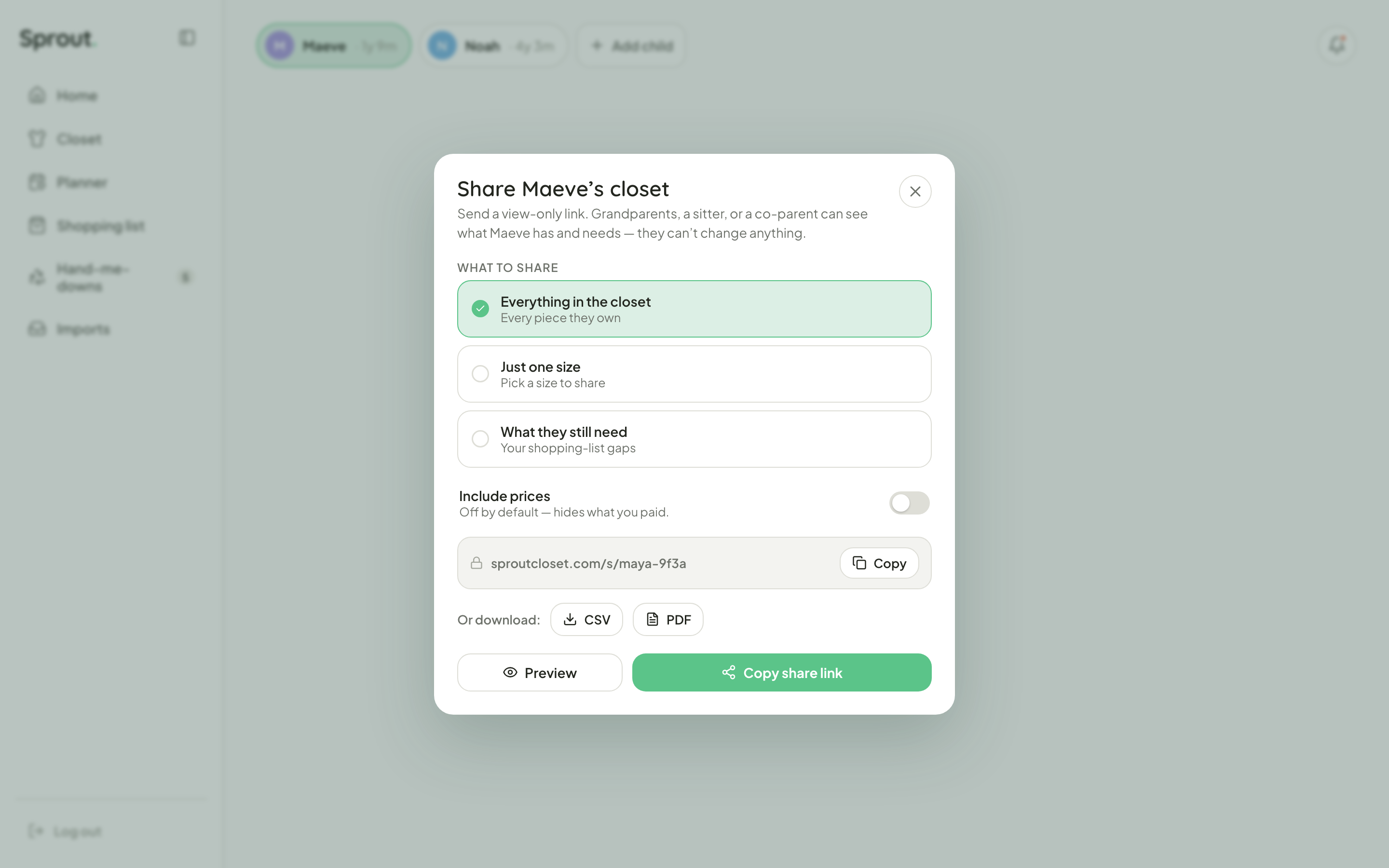
A closet’s only useful if the right people can see it. Sprout sends a view-only link (for a grandparent, a sitter, a co-parent) so they can see what a kid owns and still needs without changing anything, and prices stay hidden by default. You pick the scope: the whole closet, one size, or just the gaps. And when it’s actually time to shop, the same list exports to a CSV or a print-ready PDF, so it comes with you to the store.
sprout.app/closet
Sprout share sheet: a view-only link plus CSV and PDF export
Share: a view-only link for family, or CSV / PDF to shop from
Where it landed

from a spreadsheet to a real product

What started as pasted cells is a real React and Vite app now: auth, multiple kids, the closet, the planner, a shopping list, receipt imports. I wanted it to feel fresh and a little playful: Bricolage Grotesque headlines, a mint-and-leaf palette, a little sprout that grows while the app loads. Next up is pulling in store sales automatically, so the buy-ahead list basically shops itself.
sprout.app
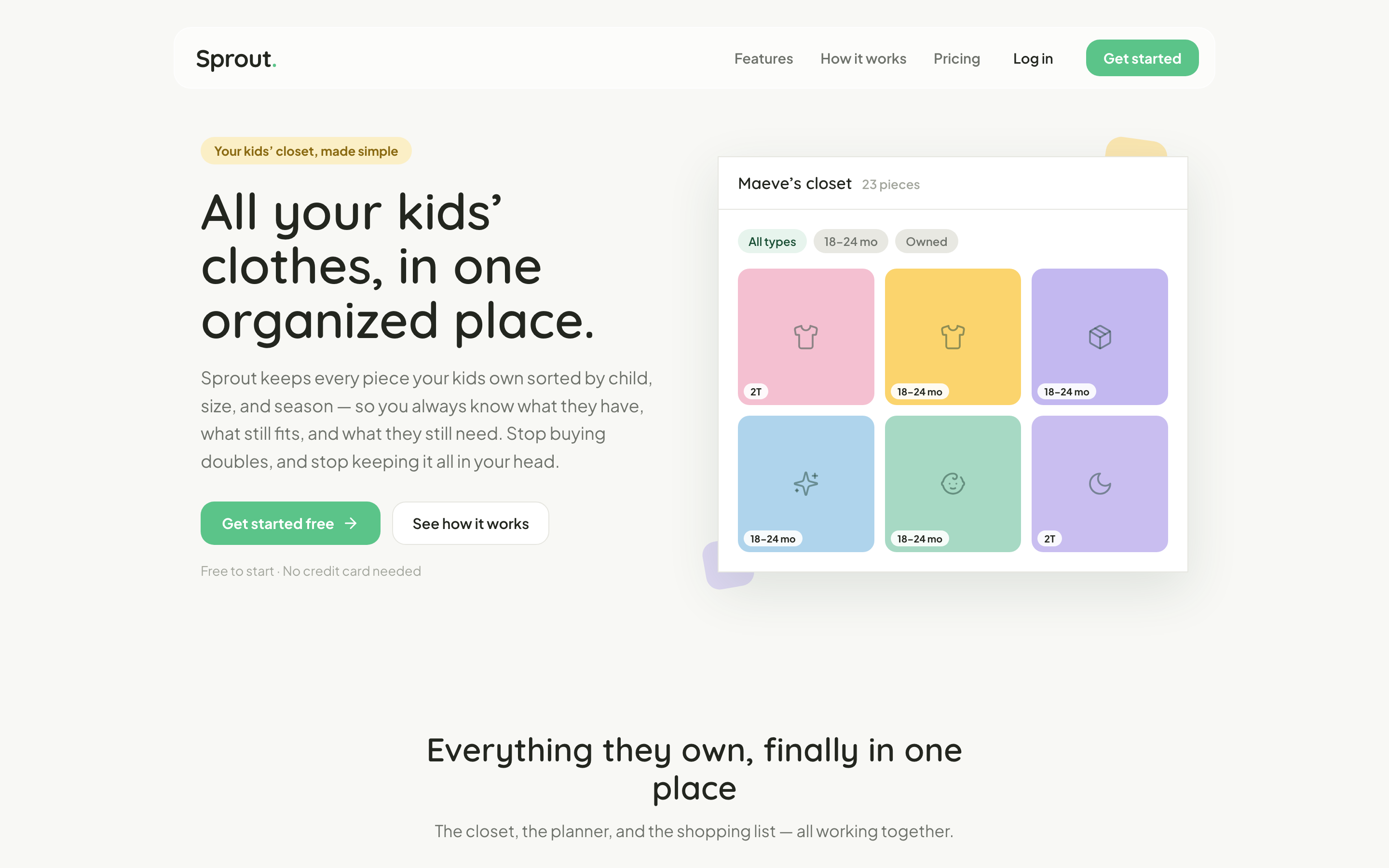
Sprout landing page
A real, working React app, not a spreadsheet pretending to be one
sprout · design system

fresh and a little playful, but disciplined in the product.

surfaces

near-white · soft shadow
White card
a recessed well: inputs & rows sink into this
White cards float on a near-white page, defined by a hairline and a soft shadow. The colorful landing calms to this for the product.
page
#FCFCFC · bg
card
#FFFFFF · surface
well
#F3F3F0 · inset
line
#DEDED7 · border
ink
#23261F · text
brand
#5BC489 · leaf

palette

playful → calm
one brand green
landing accents
Sky
Sunny
Lilac
Coral
In the product the four accents shrink to 6px status dots, leaving green to carry the UI.

type

two voices
display · bricolage grotesque
Sprout.
headlines · the wordmark · its green period
body & ui · plus jakarta sans
Aa Bb Cc 0123, every label, row, button and chip.
warm, rounded, dead-readable at small sizes.

components

a peek
buttons · lift on hover
Add childImport
chips
2TFallTopsWishlist
status dots
TopsBottomsDressesPJs
planner progress
Tops1 of 7
Bottoms0 of 5

iconography

lucide line icons
closet
planner
shop
saved
  • lucide line icons, ~1.7 stroke, round caps & joins
  • brand-green tiles: leaf-soft fill + leaf-deep stroke
  • rounded 14px tiles, never filled or multicolor

motion

lift & nudge
the feel, hover a chip to see it
lift
cards & buttons rise 2–5px on hover, settle on click
nudge
CTA arrows slide → on hover
spring
feature icons pop & tilt (cubic-bezier overshoot)
pulse
the wordmark's green period breathes while loading
shimmer
skeletons shine left→right as data lands